Wednesday, 22 July 2015
A Fine Balance
Balancing Barn
Thorington, Suffolk 2010
MVRDV
Like a scintillating spacecraft that has touched down in Constable Country, MVRDV's Balancing Barn is the perfect rural retreat for jaded metropolitans
Distinctive buildings are rarely a compromise; they stand out because it is accepted that a price must be paid for being different. The Balancing Barn, built for Living Architecture by Dutch practice MVRDV, is a good example. Their decision to create a single-storey linear holiday home that cantilevers daringly over an escarpment turns the building into a giant truss, whose diagonal struts crash across many of the windows. A large glass panel in the living room floor draws attention to the disconcerting structural arrangement. The layout is tailored for short stays rather than permanent habitation. Two doors lead into the generous kitchen and dining space, which has wide sliding glazed doors on each side. From here a side corridor runs about 20m, past four bedrooms, each with en-suite bathrooms, to the living room.
Wrapped in gleaming stainless steel, at the end of a tree-lined gravel drive retained from a previous house on the site, the Balancing Barn appears like a surreal cabin. Enigmatically oscillating between readings as a solid volume and reflective surface, the building both emerges from and merges with its leafy context, poised between integration with and detachment from nature.
Most of the structural heavy lifting is done behind the external skin: this is a building that pulls out all the stops to achieve instant 'look-no-hands' visual impact. The form of the structural braces is exposed in the corridor and living room, although the steel is wrapped in timber panelling, which also lines the walls and ceilings. In the bedrooms the structure is mainly concealed, within thickened wall and ceiling zones.
The ’otherness’ of the Balancing Barn is further emphasised by its relationship with the ground: a bold shadow gap at its base and galvanised mesh ramps at all door thresholds suggest detachment. A hinge detail where the ramp frames connect to the building implies that they could be pulled up to form defensive shields.
Is all this transgression worth the effort? Suppose that the cantilever was replaced by a column? Yes, this might allow the diagonal braces to be removed from the window openings, making it possible to enjoy standing just inside their threshold, but it would also undoubtedly dilute the architectural idea of release from the ground. Even the braces have a positive aspect: of reinforcing a sense of enclosure and protection from the outside world. At the entrance, in the kitchen dining space and in the end wall of the living room, generous unrestricted windows, are made special by contrast with the layered construction of the braced windows. A few days in the Balancing Barn, a building poised between dream and reality, allow an escape from the humdrum.
Tuesday, 17 March 2015
Fondation Louis Vuitton - Luxury Branding in Paris
Fondation Louis Vuitton
Paris 2014
Gehry & Partners
Is there more to Gehry & Partners' new gallery for the Fondation Louis Vuitton in Paris than a fusion of luxury branding?
Frank Gehry has come a long way since his pioneering 70's junk constructivism in Santa Monica. There isn't a scrap of corrugated steel sheet or chain-link in sight at the Fondation Louis Vuitton in Paris, where he has built a no-expense-spared cultural monument to the designer handbag magnate; but a lifetime's experience have found new expression in what is, quite possibly, his masterpiece. Instead huge billowing sails of curved glass, some delicately fritted, float amongst the tree canopy of the Bois de Boulogne. Located next to mature woodland and on the edge of the Jardin de Acclimatation, where amusement pavilions have entertained generations of young Parisians, the Fondation offers aerial promenades with views out to the woodland and beyond to the city.
At the core of the building, galleries are simple hangars with framed views through the frenetic outer wrapping to the park. Unlike those other notably flamboyant free-form Galleries, the Guggenheim in New York by Frank Lloyd Wright, and in Bilbao, by Gehry himself, at the Fondation there is a disjunction between display spaces and the elaborate gymnastics of the building envelope. The great spatial and experiential richness that this generates epitomise the best of Frank Gehry's work.
Although benefitting from improvements to the environs funded by Louis Vuitton, the frivolous equilibrium of the Jardin de Acclimatation is nonetheless disrupted by the sheer bulk of its new neighbour. However, the monumental scale of the Fondation engages more positively with the extensive Bois de Boulogne and the Grands Projets that punctuate the city; perhaps appropriately for our uncertain times, a flurry of commas and brackets answering the emphatic exclamation mark of the Eiffel Tower!
Does the Fondation Louis Vuitton represent the triumph of style over form? Like the luxury accessories that Vuitton has marketed so successfully, Gehry's distinctive architectural approach delivers cultural cachet; the building also locates architecture within the broader spectrum of the design industry and is a seductive advert for both the Vuitton and Gehry brands.
Paris 2014
Gehry & Partners
Frank Gehry has come a long way since his pioneering 70's junk constructivism in Santa Monica. There isn't a scrap of corrugated steel sheet or chain-link in sight at the Fondation Louis Vuitton in Paris, where he has built a no-expense-spared cultural monument to the designer handbag magnate; but a lifetime's experience have found new expression in what is, quite possibly, his masterpiece. Instead huge billowing sails of curved glass, some delicately fritted, float amongst the tree canopy of the Bois de Boulogne. Located next to mature woodland and on the edge of the Jardin de Acclimatation, where amusement pavilions have entertained generations of young Parisians, the Fondation offers aerial promenades with views out to the woodland and beyond to the city.
At the core of the building, galleries are simple hangars with framed views through the frenetic outer wrapping to the park. Unlike those other notably flamboyant free-form Galleries, the Guggenheim in New York by Frank Lloyd Wright, and in Bilbao, by Gehry himself, at the Fondation there is a disjunction between display spaces and the elaborate gymnastics of the building envelope. The great spatial and experiential richness that this generates epitomise the best of Frank Gehry's work.
Although benefitting from improvements to the environs funded by Louis Vuitton, the frivolous equilibrium of the Jardin de Acclimatation is nonetheless disrupted by the sheer bulk of its new neighbour. However, the monumental scale of the Fondation engages more positively with the extensive Bois de Boulogne and the Grands Projets that punctuate the city; perhaps appropriately for our uncertain times, a flurry of commas and brackets answering the emphatic exclamation mark of the Eiffel Tower!
Does the Fondation Louis Vuitton represent the triumph of style over form? Like the luxury accessories that Vuitton has marketed so successfully, Gehry's distinctive architectural approach delivers cultural cachet; the building also locates architecture within the broader spectrum of the design industry and is a seductive advert for both the Vuitton and Gehry brands.
| The Fondation Louis Vuitton from the Eiffel Tower |
| The Eiffel Tower from the Fondation Louis Vuitton |
Thursday, 11 December 2014
Modesty in the Fish Market
Bergen Fish Market
Eder Beisel Arkitekter 2009-2011
An appropriate balance of the permanent and the provisional, subtle form carefully placed in space, facade modelling that changes character from different viewpoints, the application of glass that appears conventionally transparent and reflective, but also as solid as dark timber: Eder Beisel Arkitekter's approach shows deep understanding of the elements of architecture and how to combine them with quiet power.
This unassuming project, located on the quayside of the picturesque Vagen, or Harbour, in central Bergen, demonstrates how well confident contemporary architecture can work in a sensitive historic context. A tapered box, through-glazed for part of the ground level, it is mainly clad in stained vertical timber boards. Projecting vertical strips at random intervals are stained the colours of traditional Norwegian construction: deep pine green, yellow ochre, dark reds and white. The relationship of the building to the quayside is carefully judged: the sloping paved surface runs through the building from the street down to the harbour edge. Frameless glass and big sliding doors complete the effect with simple means. Baulks of timber incorporated into the stone paving add scale and grain.
Inside, stalls selling a wonderful array of seafood, from live giant spider crabs and gleaming fresh fish to less appetising dark red hunks of whale meat, jostle with fast turn around fish restaurants. At one end of the building service elements, such as toilets, stores, freezer units, kitchens and refuse, are neatly contained within the plain timber-clad enclosure.
A modest glass entrance at the narrow end of the tapered building contains a lift and stairs to a tourist information centre that occupies the upper level. Fitted out with birch ply panelling and ceilings, this space gives great views across the harbour to the Hanseatic warehouses of the Bryggen opposite, painted in the same colours as the Fish Market. Eder Beisel Arkitekter's modest timber and glass building, relaxed without being picturesque, demonstrates a real understanding of the character of the Bergen quayside.
Sunday, 23 November 2014
A South London Poser?
TNG Youth & Community Centre
London
RCKa 2013
Unusual without being wilful,
this south London community building poses questions about how we build and how
architecture engages with those that use it.
The project won an RIBA National Award this year for RCKa, who were also
named RIBA London Emerging Architect of the Year.
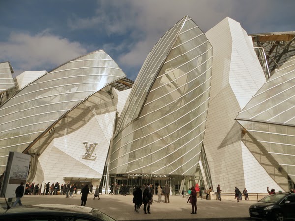
With a quicksilver surface and simple rectangular volume, TNG Youth and
Community Centre is a bold yet enigmatic newcomer among the post-war
residential blocks of the Wells Park Estate in South East London. Clear polycarbonate cladding reveals wall construction
of timber framing and silver foil insulation, provoking curiosity and slight
professional unease: questions are asked
in this project and the answers refreshingly uninhibited by convention. The building is located at right angles to
the sloping main road, its entrance facing the lower end of Wells Park and
separated from the neighbouring pub to the rear by a netted ball court. As you pass
from the external concrete ramp and steps through the deeply recessed entrance,
the interior space unexpectedly expands: you are met with tall ceilings and dramatic
multi-height spaces on three levels, interlinked by an informal stair and
surprising vistas that constantly shift and re-form as you move around the
building. Designed with a care and
discipline that communicates respect for those using it, the building is a safe
haven, providing a calm and relaxed environment, rich with casually theatrical spaces.
In contrast to the cool, silvery exterior, internal spaces are imbued with the warmth
of lightly stained engineered timber panels. Entering TNG inspires a sense of
freedom: this is an institution which offers
choices and possibilities. The reception
desk is discreetly located to one side, inviting the visitor to make their own
assessment of what is on offer.
Architects RCKa, working closely with Lewisham Council, were
instrumental in the initiation of this £3.5M project, which attracted funding
from the government's Myplace scheme. They have demonstrated great skill in
integrating the views of over 30 stakeholders; including Millwall Football Club
youth outreach programme, church groups, local youth theatres, and the
Centrepoint homeless charity. A steering
group of local young people, actively engaged in the design process, came up
with the title 'The New Generation' (TNG). The brief that developed out of this
process brings together diverse spaces: a hall, climbing wall, recording
studio, youth forum, health clinic, training kitchen, cafe, winter garden and
outdoor ball court. Despite the tight
brief, the building retains a flexible un-programmed quality. The architects had the sense to design a
building using an engineered timber system resistant to value engineering.
Without the application of these political skills there would not be a building
to discuss in any terms, let alone one that touches on the essence of what
makes socially engaged and yet aesthetically refined architecture.
A didactic note sets the tone for the construction: a preoccupation with
materials and construction underpins the aesthetic, creating an effect that is sometimes
more ‘interesting’ than ‘beautiful’. Large
irregularly distributed windows punctuate the facade, while an opening onto a
small terrace overlooking the park hints at the interlocking volumes of the
interior. The winter garden, a dramatic slot of space, lines the entire
3-storey rear facade. Robustly detailed
in sawn timber framing with clear polycarbonate cladding and a paving slab
floor, this versatile space has been earmarked to grow vegetables, but works
equally well as a break-out space or exhibition gallery.
TNG feels like a building that has been thought through from first
principles. A simple box like volume clad in sinusoidal profile corrugated panels;
the exterior encompasses a curious amalgam of the fragile and the robust:
translucent polycarbonate sheet, at high level and in protected areas to the rear
and polymer-reinforced Ductal concrete panels cast to the same profile
elsewhere. With the delicacy of porcelain, the smooth white surface of the
concrete challenges any sense of defensive construction. At high level you can see the sky through parapets
walls clad on both sides in polycarbonate. The appearance of the corrugated profile constantly
transmutes in response to the changing light, whether shadow cast across or
beneath the surface; reflection off foil-backed insulation, or the absorption
of ambient light and colour. Further refinement is added by the carefully
considered junction between adjacent panels:
butt-joints with a compressible foam packer and slim aluminium cover
strip instead of the usual laps.
Of course RCKa are by no means the first architects to adopt a polemical
attitude to construction or social engagement. Lubetkin and Tecton, made an attempt, albeit
unsuccessful, to remove the ubiquitous reception desk from Finsbury HealthCentre (1938), an institutional building which, like TNG, is easily understood
by users. Innovative articulation of
walls in Otto Wager's 1904 Vienna Post Office includes the expression of
rusticated masonry as thin stone panels bolted to an underlying substrate. RCKa’s inversion of conventional expectations
is subtly disconcerting: the Ductal
concrete cladding panels form a plinth that is also clearly hung from the structure. Above this floats the polycarbonate, an insubstantial
echo of the concrete. Visual frisson is achieved not through wilful effect, but
by a logical exposition of construction. At TNG, an ‘unfinished’ quality evokes Frank
Gehry’s early work, using cheap products like plywood, chain link and
corrugated metal sheet in projects, such as his own house in Santa Monica
(1971). Facing Wells Park, the entrance
elevation of TNG, with lateral steps and a doorway framed by a stepped composition
of contrasting materials recalls Aalto's library for the Polytechnic at
Otaniemi (1969). Like Aalto, RCKa enjoy
materiality in construction and a willingness to use this to make patterns;
they deploy the natural warmth of timber to create a sympathetic environment
for human occupation.
Instability of identity is an unusual and intriguing quality in
architecture, but one which seems to define TNG. It is a building that balances
different and ostensibly contradictory readings: monumentality and informality;
solidity and transparency; tradition and novelty; the fixed and the
provisional. This ambiguity is the outcome of careful judgement and empowers individuals
to interact with the building in a way that suits them. Empathy and respect for the users of TNG
tempers RCKa’s professional preoccupation with tectonics. If the architects pose questions, they also provide
answers.
All photos above courtesy RCKa
Subscribe to:
Posts (Atom)