Monday 25 July 2016

Helsinki - Triple Vision

Three Cultural Buildings in Helsinki

Finlandia Hall - Alvar Aalto 1961-1975
Kiasma - Stephen Holl Architects 201222
Helsinki Music Centre - Arkkitehtitoimisto LPR-Arkkitehdi 2000-2011


Comparison of Aalto's Finlandia concert hall with two more recent neighbours exposes contrasting agendas for these urban cultural institutions

The grand sweep of Alvar Aalto’s 1960’s master plan for the northern approach to Helsinki, where the city meets Kamppi-Toolonlahti (Toolo Bay), was never realised. He proposed a major new road stacked over the rail line into the city on the east side of the bay, with views across the water to a row of new cultural buildings, of which Finlandia Hall, was the only one completed. A vast paved open space, built over layered parking and shops at the city end of the bay, was also never realised.

For many years the sculptural white marble forms of Finlandia, Aalto's competition-winning scheme for a congress centre and concert halls, have been a magisterial presence on bayside central Helsinki. The architecture is highly legible: an elevated deck built out from the smooth glacial rock of the shore, with the roof of the main auditorium fanning out above. Numerous stairs lead up from the quiet road beside the lake to the principal circulation level: a great hall dedicated to arrival, with cloak storage fronted by serpentine counters. In what feels a rather low, wide space, the ceiling takes on great importance in the definition of character. Different combinations of white finished wooden slats and Aalto-designed light fittings accent the space.

Unlike the cultural institutions lining London's South Bank, which benefit from the relatively recent British adoption of 'continental style' urban cafe culture, Finlandia is a somewhat remote destination. Without people, its foyers are dominated by awkward arrangements of chairs and drinks stands. The main auditorium shares this slightly cavernous quality. Despite the best efforts of the designers, who created a large hidden ceiling volume and quasi-technical architectural sound-reflectors and diffusers, the acoustic of the hall is not ideal. Perhaps the conflicting requirements of the original auditorium brief, for speech and music, were incompatible.

Aalto resolves the potential conflict inherent in dual-aspect cultural buildings facing both water and city with assurance, investing the city approach with a more sober character, while the dramatic auditorium roof works well within the wider context of the bay. The foyer deck sits beautifully on the sloping shore of the lake. Access down from the broad avenue leading into the city is choreographed via flights of steps through the grounds. However, between bursts of social activity around the formal programme of performances and conferences, Finlandia feels a shell, somewhat disconnected from the city, at least in terms of current British cultural expectations.

Holl Architect's Kiasma Art Gallery provides loosely functional spaces shoe-horned into a flamboyant form. Although the elevation flanking the Mannerheiminttie avenue into the city and the entrance at the narrow end of the building are well defined, the relation with the park is weak and back side is a bland curved metal wall. A narrow alley flanked by a cascading rill cuts through the middle of the building, connecting the landscaped 'front’ space with a car park at lower level. The landscape context is merely the backdrop for the sculptural gymnastics of this 'object' building.

Holl is a master of theatricality and the interior of Kiasma is a good example: an etiolated ramp extends from the entrance foyer through a warped organic interior to the upper galleries. Movement through the building and between galleries is spectacularly contrived. To their credit, the gallery curators inhabit the building that Holl has created with panache, and not only for exhibitions. During my visit, pairs of performance artists were inhabiting different spaces with an improvised choreography accompanied by abstracted vocal sounds that tested and responded to the acoustic. Like Zaha Hadid's now defunct Maxxi Gallery in Rome, the building itself is the star exhibit, feeding the appetite of international cultural tourists for ever more extraordinary architecture.

The Helsinki Music Centre, the third building in this trio, is located between the other two, not only physically, but in terms of the approach. Off-trend for a winning competition entry, with a submission entitled 'a mezza voce', the architects made the case that what was required in this context was a self-effacing ’good neighbour’, rather than another ’icon’. The completed project demonstrates that a sound brief and an astute client are essential prerequisites for a good building. The Music Centre offers a programmatic alternative to the haunting absence of activity at Finlandia and the synthetic curator-injected buzz of Kiasma: it is a mixed-used building, combining the Sibelius Music Academy with concert halls for the Helsinki Philharmonic Orchestra and Finnish Radio Symphony Orchestra.

Students arriving from Mannerheiminttie to attend classes animate the site; they rehearse in the main concert auditorium, which is enclosed with glass walls and around which the concert foyer spaces wrap. Internal spaces are generous. Multi-level volumes allow good connections within the building, between different activities and to the outside. The concert hall foyers include bars and restaurants, which are open during the day, and the building spills onto a generous south-facing garden terrace with park benches and cafe seating. A large building, its bulk is diminished by the tenor of its response to the different aspects: street, park, or paved approach from the city. Green-tinged glazing and pre-patinated copper cladding tie the building into the environs of the park. Thanks to this multi-faceted approach, the building feels well integrated into its context. Despite these strengths, the envelope offers a poor sense of permeability and is not very transparent, at least during the day. This creates a slightly corporate tone of exclusion rather than one of invitation. Amid the cacophony of new attention-seeking public arts buildings, the modest intentions of the 'Mezza Voce'
approach is welcome, but its voice must still be heard.
Finlandia


Finlandia


Finlandia


Finlandia


Kiasma


Kiasma


Kiasma


Kiasma


Kiasma


Helsinki Music Centre


Helsinki Music Centre


Helsinki Music Centre


Helsinki Music Centre


Helsinki Music Centre


Helsinki Music Centre


Helsinki Music Centre


Helsinki Music Centre

Wednesday 10 February 2016

Devil in the Detail


Newport Street Gallery

London
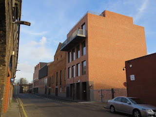
Caruso St John Architects  2015


Despite characteristically close attention to detail the construction of Caruso St John Architects' latest project conveys subtly conflicting messages

At Newport Street Caruso St John have created a suite of enfilade galleries, varying in proportion, scale and daylighting, which provide an ideal setting for the display of art from Damien Hirst's private collection of more than 30,000 pieces. ‘Power Stations’, an exhibition of John Hoyland’s bold abstract canvases, is the perfect debut for the space. 

The galleries are formed by knocking together three former scenery warehouses but, with the exception of all but a few high-level openings and some roof trusses, the existing building fabric is lined in plasterboard. Even the original character of window openings is obscured internally by white glass screens. The enfilade layout is such that the wall flanking the street is available as a straight, uninterrupted and completely flexible hanging surface, tending to unify the disparate volumes of the original buildings. This is an Alice in Wonderland space, once-removed from the substance of the original fabric and its urban context. Perhaps that is a positive feature for an art gallery: allowing the visitor to be enveloped by the art and transported to an interior landscape of the imagination. 'White Box' has become a pejorative term, but it scarcely does justice to the rich spatial sequence that Caruso St John have created. Hirst needs a flexible set of gallery spaces in which to display his collection. He can do that simply by re-hanging each show within the available space or using parts of the gallery for smaller exhibitions.

Jan-Carlos Kucharek in the RIBA Journal astutely notes the disparity between the suppressed materiality of the display space and the intensity of architectural expression in the three public stairs. It is true that apart from the continuity of the screed floor, there is little connection between the stairs and display areas. This is arguably a weakness in the architects' parti that diminishes the constituent parts, fragmenting the experience of moving around the galleries.

The technical virtuosity of the stairs is impressive, but veils the curiouser-and-curiouser nature of their construction. In contrast to the plasterboard-faced gallery interiors, the drum-like stair enclosures are lined in a white brick. The mass of the masonry is emphasised by the use of a header bond on the curves and a recessed pre-cast concrete handrail. Upper masonry soffits are pierced by a central roof lights and lined in header bonded brick. Where door openings cut into the drum of the stair, the soffit brickwork is in a staggered radial pattern with tapered mortar joints. The construction has the glacial charm of a Victorian institution, perhaps not entirely accidental, since it complements Hirst's preoccupation with the pharmacy and laboratory. 

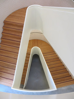
Inserted into these enclosures are the stairs themselves: complex three dimensionally curved objects, formed in timber with digital precision. The soffit and guarding are lumberboard faced in white oil finish spruce. Treads and risers are made from strips of clear-coated oak, while contrasting nosing strips are picked out in a darker hardwood, but this is set one strip in from the edge of each step, a device more decorative than functional. The stairs are disengaged from the wall by 20mm, but sit directly on the screed ground floor, with no shadow gap. Seen from below, the white timber of the stairs within the brick enclosure is visually coherent. Moving up or down the stairs, the contrast between the light timber and massive masonry on each side feels unbalanced and complicated. 

The stairs are neither 'objects' within in a shaft, like, say, Kahn's stair at the Yale Center for British Art, nor are they wall-supported, like Inigo Jones' stair at the Queen's House in Greenwich. The traditional pattern wall-supported stair tends to have a visually light guarding around the void of the well that is a logical expression of its structural form, as well as allowing top light onto the steps. By contrast, the straight flights of Kahn's stair span between landings built into the walls of the enclosing concrete drum. Kahn’s guarding is the same on each side, allowing the stair to read as an autonomous element and intensifying the experience of movement through the space. Although Caruso St John follow the same constructional principle, the flights hug the curved wall surface without actually touching it. Virtuosic precision fails to compensate for an incoherent relationship between the parts and the whole.

The construction of the exterior is refined: new buildings flanking the retained warehouses are constructed in brick using a variety of bonds. A grey brick is laid in header bond on the front base storey, with stretchers on the plan reveals and a course-thick brick lining to the soffit. In fact these are not the hard engineering bricks that they appear. Corners have already been chipped off the reveals of door openings to reveal a pink core. In the 'Drum Road' Backstage at the National Theatre Lasdun avoids this problem by using bull-nose bricks on corners, a robust detail with 19C industrial heft. Above the ground floor at Newport Street reddish bricks are laid to Flemish bond. All brickwork is laid with lime mortar, negating the requirement for visually disruptive movement joints. 

Existing brickwork has been violently scrubbed, presumably with the intention of creating an aesthetic unity with the masonry of the new buildings. Any residual sense of authenticity in the original timber windows, in a variety of different patterns, either copies or heavily repaired, is undermined by back-lighting and blank plaster linings at street level. This treatment occupies the queasy territory of retained facades, where the construction of the envelope is devalued to the status of thick wallpaper.

The Newport Street gallery is a project of great virtuosity, but one in which subtle constructional contradictions are rife: the stairs, the brickwork and the treatment of existing fabric. Despite the rich variety of formal expression, the material quality of its construction is never entirely persuasive as the-thing-itself, because it seems deployed more for its aesthetic qualities than as an expression of tectonic order. This is not a moralistic quibble about 'truth to materials' in the work of Caruso St John, it is just that it renders their architecture less convincing than it might otherwise be. It is not possible to create an effective aesthetic order based on the expression of construction, if that construction lacks a coherent logic.

Thanks to Shaira and Michael for illuminating a wet Saturday morning


Queen's House, Greenwich, Inigo Jones 1635 - Photo: McginnlyWikicommons


Yale Center for British Art, Kahn 1953 Photo: Minke Wagenaar


Yale Center for British Art, Kahn 1953 Photo: Minke Wagenaar


Wednesday 11 November 2015

League Champion

Sports Arena 
Rovaniemi, Finland
APRT Architects 2015


APRT Architect's Rovaniemi sports arena is a brilliant exercise in style and economy

Construction of a fine new sports arena is nearing completion in the Finnish town of Rovaniemi, on the edge of the Arctic Circle. Located near the town centre and backing onto a major road, this low-budget project provides an all-weather pitch and athletics facilities for community use and RoPs, a small professional football club. Rovaniemi is a pleasant town in a magnificent setting on the banks of the wide and fast-flowing Kemijoki River and distinguished by a post-war masterplan and civic buildings by Alvar Aalto

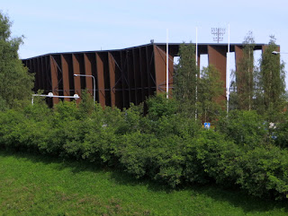
First indications that the stadium design is something special come from glimpses between buildings and trees of the monumentally-scaled blades of its dark brown structure. But this is not the richly textured oxidised steel of top-end Corten construction. Closer examination reveals that the construction of the structural blades supporting the stadium superstructure is actually vertical steel trusses clad in brown-stained ply and sitting on in-situ concrete piers. Banked ground between the stadium and the road provides simple and elegant access to the rear of the seating tiers. 

In APRT Architect's competition-winning design the staggered layout of blades, which animates the composition when seen from different viewpoints, interlocks with a zig-zag arrangement of residential and office buildings facing onto the busy road. Even without this element of the design, the stadium has a compelling presence.

The blades frame panels of sky, defining irregularly shaped tiers of multi-coloured seats. Anyone who has sat through a thinly attended event will know just how dispiriting the experience can be. The Rovaniemi sports arena is more than a simple container for spectators: rich form and patterning contrive to populate the stadium, regardless of actual attendance. APRT Architects are to be congratulated for a fine building, skilfully executed on a tight budget.


Previous blogs on sports venues:
Hackney Football Centre (Stanton Williams)
London Olympics: Velodrome (Hopkins Architects) and Aquatic Centre (Zaha Hadid Architects)
London Olympic Site revisited
London Olympic Park

Wednesday 22 July 2015

A Fine Balance


Balancing Barn 

Thorington, Suffolk  2010

MVRDV


Like a scintillating spacecraft that has touched down in Constable Country, MVRDV's Balancing Barn is the perfect rural retreat for jaded metropolitans

Distinctive buildings are rarely a compromise; they stand out because it is accepted that a price must be paid for being different. The Balancing Barn, built for Living Architecture by Dutch practice MVRDV, is a good example. Their decision to create a single-storey linear holiday home that cantilevers daringly over an escarpment turns the building into a giant truss, whose diagonal struts crash across many of the windows. A  large glass panel in the living room floor  draws attention to the disconcerting structural arrangement. The layout is tailored for short stays rather than permanent habitation. Two doors lead into the generous kitchen and dining space, which has wide sliding glazed doors on each side. From here a side corridor runs about 20m, past four bedrooms, each with en-suite bathrooms, to the living room.

Wrapped in gleaming stainless steel, at the end of a tree-lined gravel drive retained from a previous house on the site, the Balancing Barn appears like a surreal cabin. Enigmatically oscillating between readings as a solid volume and reflective surface, the building both emerges from and merges with its leafy context, poised between integration with and detachment from nature.

Most of the structural heavy lifting is done behind the external skin: this is a building that pulls out all the stops to achieve instant 'look-no-hands' visual impact. The form of the structural braces is exposed in the corridor and living room, although the steel is wrapped in timber panelling, which also lines the walls and ceilings. In the bedrooms the structure is mainly concealed, within thickened wall and ceiling zones.

The ’otherness’ of the Balancing Barn is further emphasised by its relationship with the ground: a bold shadow gap at its base and galvanised mesh ramps at all door thresholds suggest detachment. A hinge detail where the ramp frames connect to the building implies that they could be pulled up to form defensive shields.

Is all this transgression worth the effort? Suppose that the cantilever was replaced by a column? Yes, this might allow the diagonal braces to be removed from the window openings, making it possible to enjoy standing just inside their threshold, but it would also undoubtedly dilute the architectural idea of release from the ground. Even the braces have a positive aspect: of reinforcing a sense of enclosure and protection from the outside world. At the entrance, in the kitchen dining space and in the end wall of the living room, generous unrestricted windows, are made special by contrast with the layered construction of the braced windows. A few days in the Balancing Barn, a building poised between dream and reality, allow an escape from the humdrum.