Sunday, 30 September 2012

Reincarnation of the Butterfly


Kaywana Hall, Devon
Mervyn Seal 1962, rebuilt by Stan Bolt 2009

When the current owners bought this secluded 1960’s house they originally planned to repair it.  Later they decided to demolish and rebuild it, raising questions of authorship and highlighting how construction and patterns of domesticity have changed in half a century

Whilst on holiday in Devon this summer I stayed at Kaywana Hall, a house that Mervyn Seal built for himself and his family in 1962.  It is hidden in 6 acres of steeply sloped woodland at Kingswear, across the river from Dartmouth.  Over the years, as his family grew, Seal made alterations and added accommodation.  Around this time, during what must have been a golden period of his career, he designed a series of striking houses in Devon.  Typically they took the form of an elongated box with a ‘V’ profile roof expressed on the long elevation.  The floor stepped up from the ground in whole and half levels, lifting the house above the landscape and creating a dramatic interior space beneath the raking roof profile.  They were dubbed ‘butterfly houses’.  Seal cites the double-height living spaces of Le Corbusier’s Unite d’Habitation as an inspiration.  The roof and end walls were extended beyond the plane of the long facades to create an ‘M’ shape providing some solar shading and investing the construction with an 
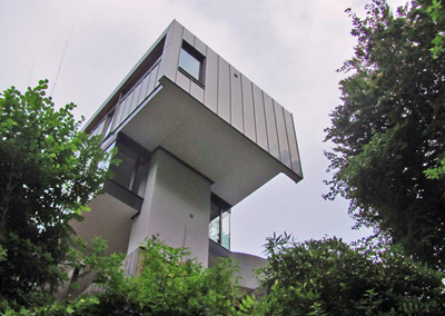
abstract character.  Kaywana Hall projected dramatically above the slope of the site.  A steep hair-pin drive led up through trees to arrive at a carport under 
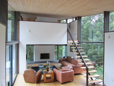
the house, with views across a swimming pool to the woods beyond.  The living space was at first floor level with heavily glazed elevations looking back to the approach and over the pool.  Three bedrooms were located at upper ground level.  At the opposite end of the house the second floor master bedroom was cantilevered into the tree-tops.  It must have come as a bitter blow when circumstances obliged Seal and his family to leave the house in 1992.

About 8 years ago Tony Pithers and Gordon Craig fell in love with the house and bought it, with the intention of repairing it.  Following the advice of local architect Stan Bolt they decided to demolish the building and rebuild, broadly following the original design.  This might at first seem a strange approach, particularly from a conservation viewpoint, where original construction is highly valued, but it enabled the building envelope to meet current environmental standards.  The approach also allowed some unfortunate later additions, such as the infilling of the spectacular carport, to be stripped away.  At a late stage in the design process the client decided to detach the secondary bedrooms from the house, enabling their use as luxury bed and breakfast accommodation, with guests eating breakfast in the dining space of the main house.   

This new arrangement works well for the client and Bolt’s confident rebuild is arguably clearer conceptually than the original design.  The interior is certainly improved by a more open plan arrangement, something that would have been less practical in a house occupied by more people.  The use of materials and detailing is of a very 
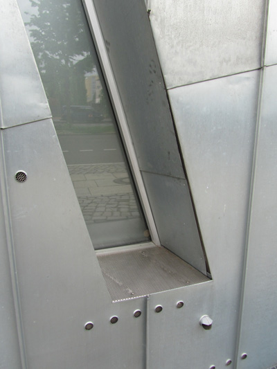
high standard throughout.  Pre-patinated zinc is used to clad the roof and selected wall elements, while walls are in a white render.  Floors are finished in wide oak boards and the raking soffit of the house clad in a light stained softwood board.  The original chimney and cantilevered concrete platform of the master bedroom were retained, but the stone of the earlier construction has been suppressed in favour of white render.   Coloured glass panels and white framing to the glazing, which lent a painterly abstraction to the original surface of the facades, have been replaced with a  more neutral palette of dark timber and slim profile aluminium glazing, but the delightful open stair, with its fishbone steel structure, has been retained.  Each incarnation of this unusual and lovely butterfly is the product of a gifted architect, and the work of both deserves greater attention.


Wednesday, 19 September 2012

Why BD’s Carbuncle Cup is Mistaken


Building Design magazine’s Carbuncle Cup, an award for the worst UK building completed in the past year, singles out Grimshaw Architect’s Cutty Sark scheme as this year’s ‘winner’.  Whilst I agree with Ellis Woodman’s critique of the project, the Carbuncle Cup is misconceived because of the way in which it humiliates the recipient.  It adopts the emotive language of Prince Charles’s notorious criticism of  Ahrend Burton & Koralek’s National Gallery extension, which he likened to a ‘monstrous carbuncle on the face of a much loved and elegant friend’.  

Perhaps amusing in private, or on the pages of Private Eye, this sort of labelling has no place in the serious architectural press and debases the currency of criticism.  It is wrong to single out one project and its author for vilification.  There are many bad buildings.  They are not only the result of poor judgement, more often they are also the outcome of conspiring circumstances:  pressure for over-development, the wrong brief, budget constraints and statutory restrictions.  

The real scandal is not the occasional spectacularly misjudged attempt by architects to create something special, but the insidious mediocrity of much of what is built, mainly designed by people who are not architects.  This reflects an underlying problem:   a general lack of appreciation of good design and an unwillingness to pay for it.  The annual award of the Carbuncle Cup has become a blood sport and BD does itself a disservice by persisting with it.  The architectural press has an obligation to raise the debate and should take a hard look at what passes for criticism on its own pages.

Wednesday, 29 August 2012

Twilight of the Games


London 2012 – The Olympic Park Revisited
Athletics events had started in the Stadium when I revisited the Olympic Park during the second week of the Games and the arrival of an additional 80,000 spectators from all over the world charged the atmosphere. Although the Park and venues have provided a great setting for this transient festival of sport, the pressure of managing the large number of spectators has led to extensive perimeter crowd barriers and tented ticketing pavilions. This creates an odd situation, in which even fine permanent structures acquire an ad hoc character. In previous blogposts* I have criticized the temporary spectator stands at Hadid Architects’ Aquatics Centre, but in retrospect there seems little alternative to accepting a husk of temporary accommodation and Olympic branding, which will be cast off on the conclusion of the Games. In fact access to these temporary stands, via stairs which penetrate the raking structure, has an expedient grandeur.
The foundation for the success of the Olympic Park lies in the infrastructure of paths, bridges, copses and meadows that have been overlaid on the banks of the river Lea. Add carefully placed temporary structures, several permanent buildings and a hundred thousand spectators and you have a wonderful environment for the Games. For those lucky enough to have been there, the memory of the sporting drama at this place will stay with us for a long time to come. We can look forward to the Park opening to the public next year and hope that the redevelopment of the area following the Games will also confound the sceptics.
*blogpost 28.04.12 & 05.08.12
The Aquatics Centre temporary stand


The Basketball Building

The Velodrome

Signage is crude but effective

The Water Polo Building

Temporary stands and access smother the Aquatics Centre

Temporary crowd barriers and tented pavilions are ubiquitous

Temporary access and signage at the Aquatics Centre


Access to the temporary stands - Aquatics Centre


Inside the Aquatics Centre

Sunday, 5 August 2012

Olympic Park


2012 Olympic Park  London

At the halfway point in the 2012 London Olympic Games we can enjoy not only our success in winning medals, but satisfaction in delivering such a major international event with imagination and efficiency. The Olympic Park is a great achievement.   It would be unreasonable to judge a temporary event by normal criteria, but is it possible to create a high quality environment at such a mammoth scale for use over a few weeks?   

When I visited the Olympic Park on Monday to attend some preliminary handball matches there was a festival atmosphere.  An unprepossessing entry to the site, approaching from West Ham through steel security gates, is quickly dispelled by a coherent landscape design, with the Athletics Stadium at its centre and bound together by sculpted landforms with generous paths and spectacular swathes of flowering meadow.  A background concern at the Games has been the threat of terrorism and the organisers have done well to restrict visible security to the screening of visitors entering the site.  The atmosphere is relaxed.  

Many of the structures are temporary, some built with more panache than others, although this might just be a reflection of different budget constraints.  The hooped surface of Wilkinson Eyre’s Basketball Arena and AEW’s timber framed McDonalds outlets have distinctive identities, but the Water Polo building and temporary spectator stands of the Aquatics Centre appear clumsy.  Many of the buildings are screened off at ground level with fabric covered standard steel barriers.  This is a real pity, especially for the Velodrome and the Orbit tower, both dynamic designs which would otherwise engage well with visitors.  Similarly, there are many tented temporary structures for security checks, food outlets etc.  The experience on the ground is often governed more by these modest elements than the grand gestures of ‘object’ architecture.  Would it have been possible to design screening and secondary accommodation in such a way that it reinforced the refreshingly bold landscape strategy, rather than created a barrier between the buildings and their environs?

Hopkins’s Velodrome* is outstanding, reconciling expressive form with highly sustainable design.  Although Hadid’s Aquatics Centre* is marred by the large temporary spectator stands, in legacy mode this will surely be a beautiful building, even if the heavy sculptural structure is less sustainable than that of  the Velodrome.  The handball matches that we attended were played in Make Architect’s ‘Copper Box’.  This refreshingly unpretentious building is clad in salvaged copper sheet and destined for use as a flexible use community sports venue after the Games.  The Athletics Stadium, Orbit tower and Velodrome are well integrated into the landscape.  Minor criticisms of the temporary configuration will certainly be forgotten as we see the development of Olympic Park into an enduring legacy for the 2012 Games.  *blogpost 28.04.12

Approach to the Park from West Ham

The bold landscaping unifies the site

Crowds watching the big screen

The ArcelorMittal Orbit

Barriers obstruct many buildings

The Basketball Arena and more barriers...

The McDonalds outlets are well designed temporary structures

The Water Polo Building (left) and the Aquatics Centre
The 'Copper Box'


Inside the 'Copper Box'


Thursday, 26 July 2012

Cultural Trauma


Judisches Museum  Berlin

Daniel Libeskind  1999

Histrionic zinc-clad forms create an ‘iconic‘ identity for Daniel Libeskind’s Judisches (Jewish) Museum in Berlin, yet this intensity is dissipated inside, where prosaic displays sit awkwardly within the fragmented interior.  Is it a shortcoming of the museum building or the display that makes a visit to this museum so frustrating?  

Divergent agendas for the architect and the curators appear to lie at the root of the problem – the architecture is fractured and contorted, arguably giving concrete expression to the horror and loss of the Holocaust, whereas the display depicts the continuity of 2000 years of Jewish history in Germany and emphasises the quotidian life and contribution to society of the increasingly acculturated Jewish community.  The problem is that ordinariness is a narrative lacking in drama, which is why the ‘voids’ that Libeskind has left in the building speak so eloquently of the loss and the absence of those whose lives were brutally interrupted.  These compressed vertical spaces, dimly lit and claustrophobic, are intensely beautiful.

Entry to the museum is through the adjacent 19th century villa, which contains (heavy) security, cloaks, tickets and a cafe.  Dark stairs drop down from inside the villa to the lower level of the new building, a disorientating sloping floor and a series of angled intersecting corridors with harsh fluorescent lighting.  Disorientation turns to irritation when displays can only be viewed by one person at a time standing directly in front of a clear circle within the fritted glass.  Wall surfaces are dry-lined, a finish lacking in appropriate substance.  Each of the three corridors is a thematic axis representing Holocaust, Exile and Continuity.  These axes culminate respectively in a tomb-like ‘void’, a tilted garden of concrete blocks and willows (Eisenmann’s 2005 Holocaust Memorial, also in Berlin is very reminiscent of this space - blogpost 15.05.12) and stairs up to the remainder of the display.  The ‘Continuity’ display is on a linear route and follows the fragmented Star of David geometry that generates the form of the building.  This geometry cannot be perceived and the lack of choice, as the route leads inexorably on through an awkward succession of display tableaux, is increasingly alienating.

In one of the voids an evocative installation by Menashe Kadishman (blogpost 07.06.12) responds to both the difficult content of the museum and to the architecture.  Like some of the most brilliant buildings, the Jewish Museum is at once highly polemical and deeply flawed, but this lends it intensity.  Can the mute expression of architecture and art transcend the inadequacy of the conventional museum display?  However eloquent the architecture, the stridency of the interior compounds the fumbling inadequacy of the exhibition design.   This important story deserves a better account.